Sandals Resorts International is an all-inclusive high-end resort located along the Caribbean Islands. For this collaboration project, the client wanted to improve the user experience of their guests for their outdated TV Interface system by upscaling the design in collaboration with In-Vision, an interface-developing company.
Pain points
The existing interface could have been more precise, manageable, and user-friendly.
The TV channels and TV stream apps section from the old system was overwhelming and challenging to navigate.
To inform the guests of all inclusions, dining experiences, extras, account information, resort map, current location, and other important information.
Goals
The project aimed to create a user-friendly and intuitive interface, enhancing the viewing experience and providing guests with practical activities and resort information.

Research & Findings
The primary research included analyzing other leading TV stream apps' interfaces to identify best practices, specs, and design principles. In addition, to understanding In-Vision study case's areas and their areas of improvement.
The secondary research embraced understanding all the feedback provided by the guests, the pain points of guest-related departments, and how they handle resolving guests' concerns.
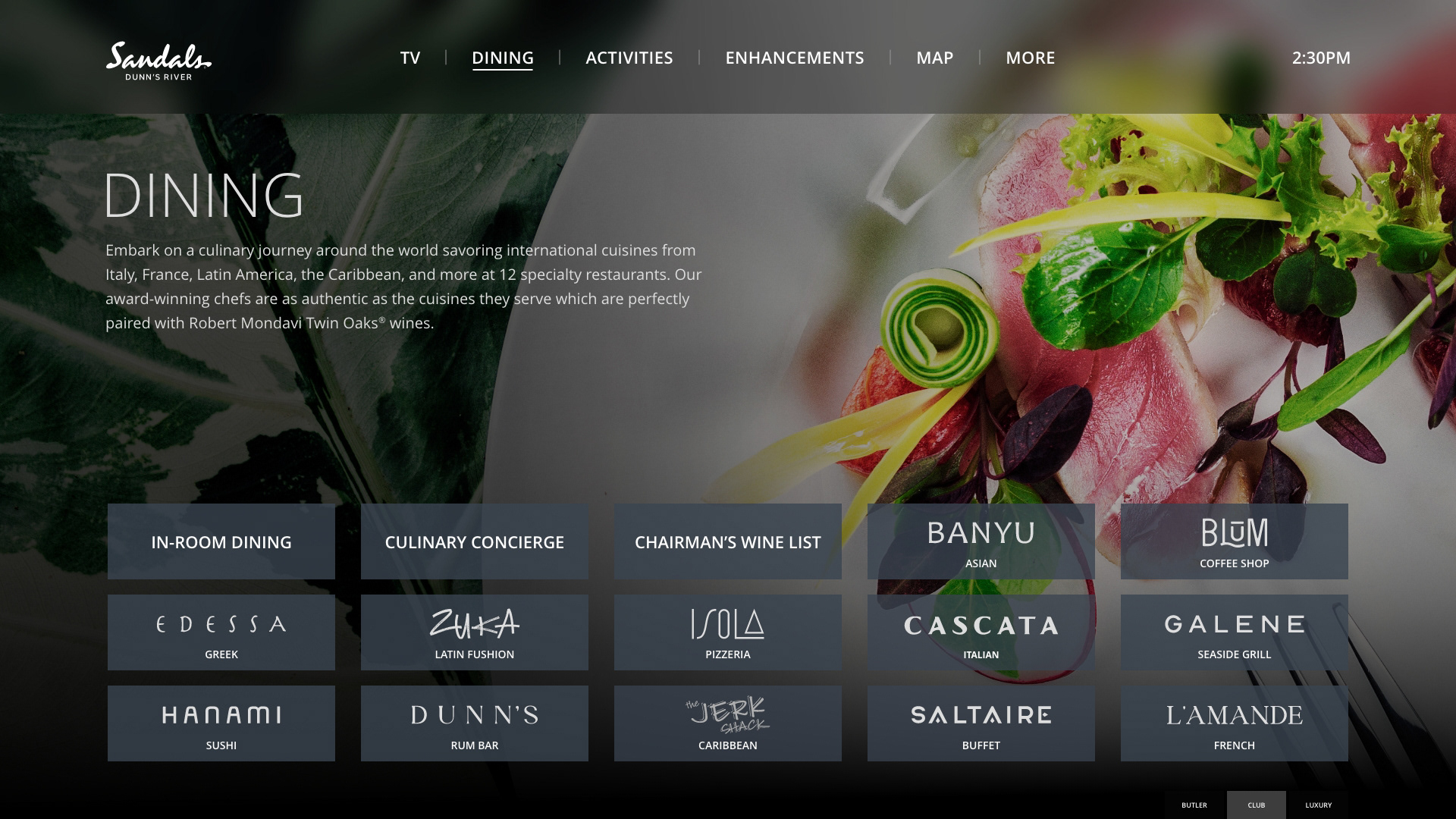
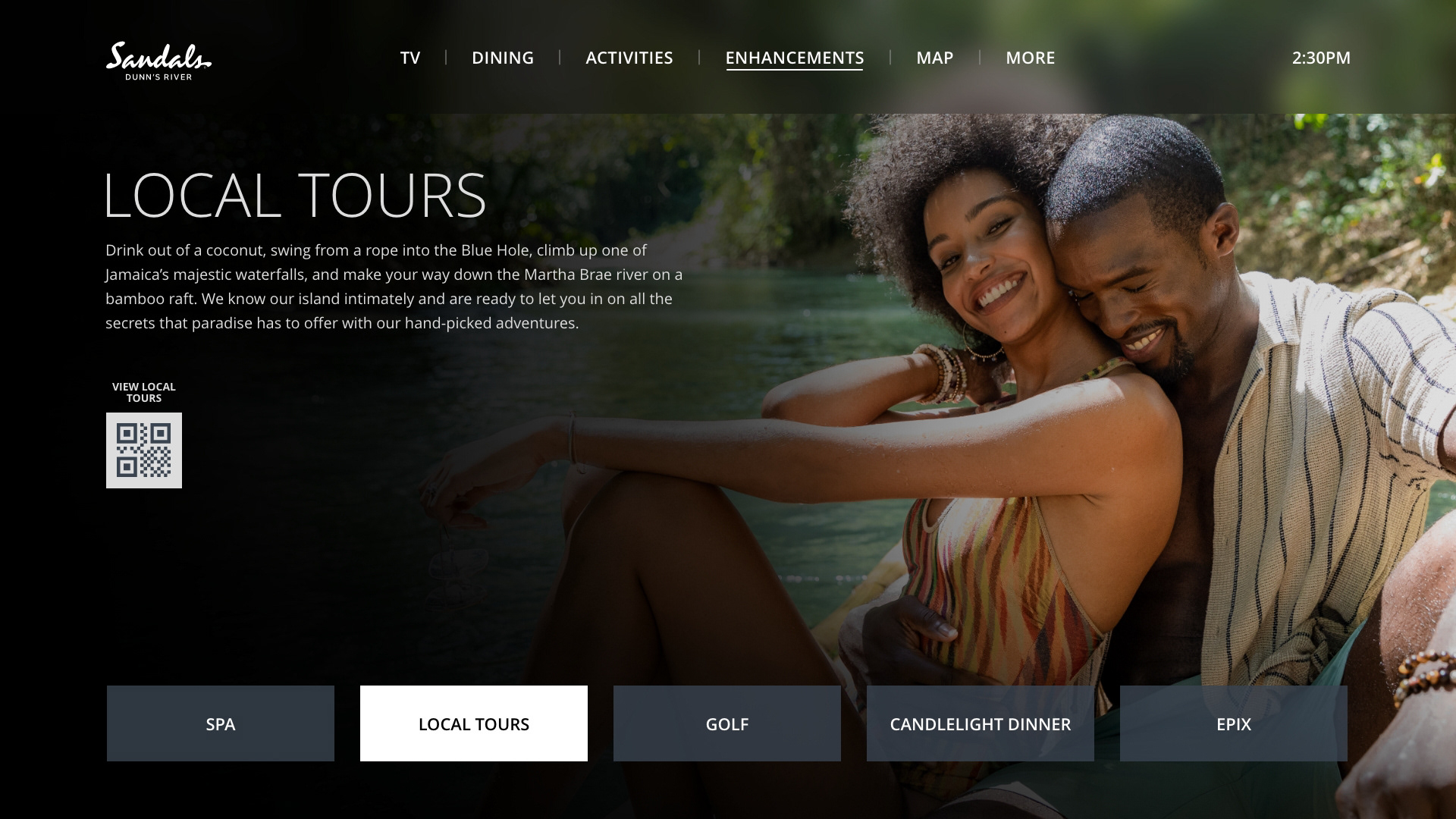
Based on the research findings, the new system efficiently provides information about the resort's inclusions, dining options, extra enhancement services, and general account information, giving the guests more autonomy in planning their stay and managing their time, which would also alleviate the front desk with the flow of phone calls or guests searching for information or print material.
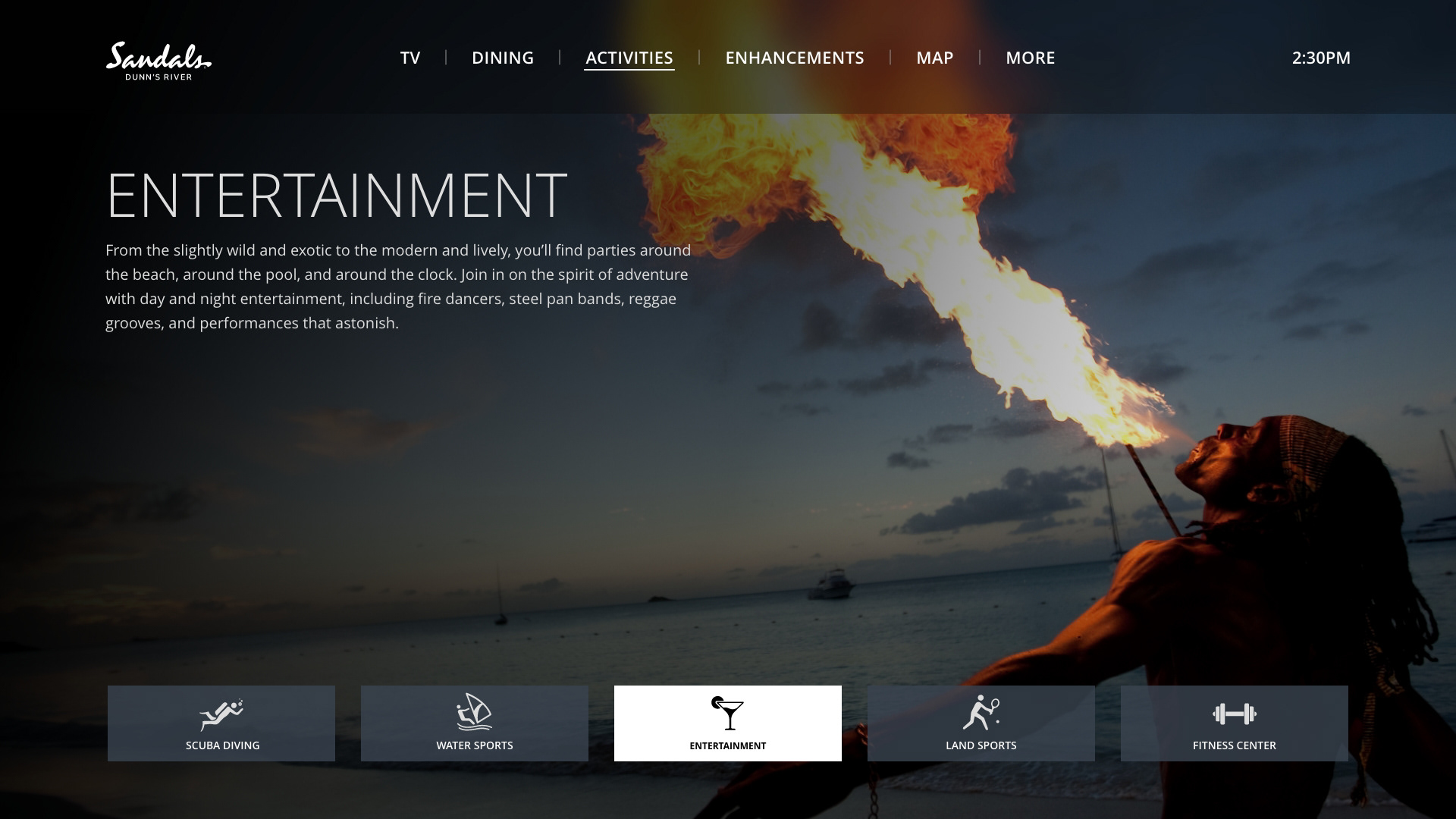
In addition, the entertainment section allows guests to view local TV channels and TV streaming apps more efficiently. The experience is seamless and informative, helping the guests to decide on their activities more efficiently.
Importance of Project Documentation, Sketching, and Wireframes
The initial design and flow of wireframes considered the needs and goals, the skins/screens set by the provider, and the best practices applied by leading TV stream app providers. The client insisted on not developing a full wireframe flow but speeding the process to high-res prototyping.
The decision to design an interface that meets best practices for stream apps originated an array of design and coding challenges that prompted me to understand the system's structure and request from the New Media team a collaborating position to meet the provider's specs expectations.
As the project and testing advanced, the cross-collaboration between departments grew, which led to the implementation of project documentation tools, such as Microsoft Share Point and Jira, to register all the documentation and design processes and evolution of the project.
The Information Architecture Map played a pivotal role, the document that, along with other collaborative files, helped the members from across the different departments stay in line with the project while gathering content (assets, icons, QR codes, copy content, and more.)
Design Process & Prototyping
During the design process In-Vision and I worked closely to adapt their skin templates into the approved prototype. We found particular limitations on their end, but we resolved them by adjusting the design system elements and assets to meet their restrictions and bring to life the approved design.
After user testing and feedback (from users and members of different logistics departments), the design result included important information that would effectively help them manage their experience and carefully curated visual assets to cue such experiences to meet brand standards.
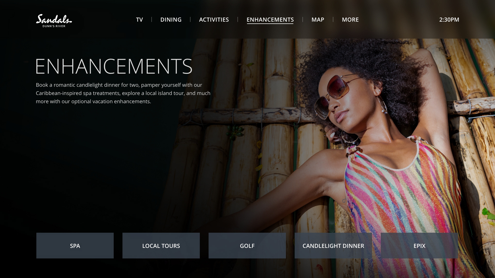
Part of the iteration process included closely defining the information architecture and cohesively developing a menu and sub-menu that could cover all the essential information.
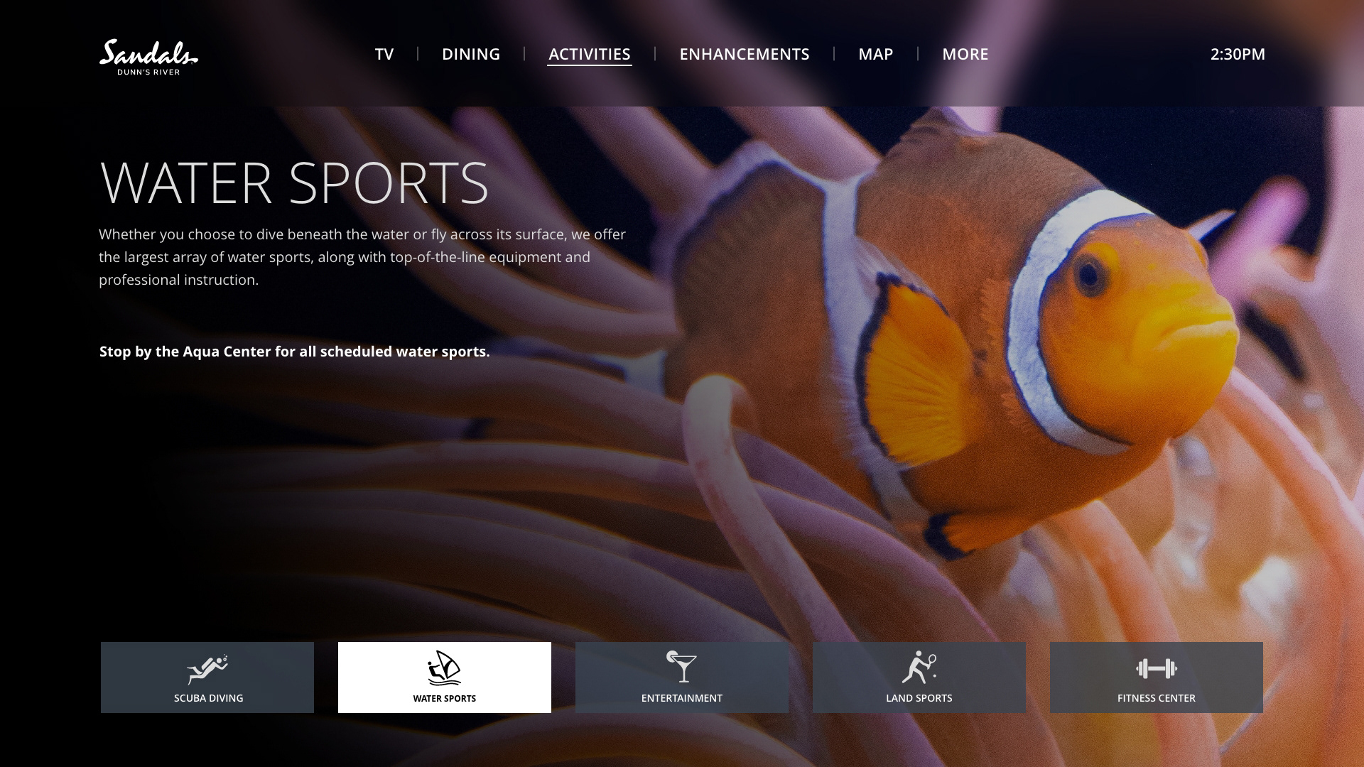
In addition to the interface structure, finding the right images for the background needed to consider specifications, such as a safe area for eligibility of the copy content; considerations included a consistent dark gradient throughout all the photos or videos, but carefully adapting and editing them as per the visual content of each image, sub-brand logos, and icons used along the brand.